Quality packaging and label design should be a top priority for small-scale manufacturers right from the start. You can run your business from your bedroom and still look polished and upscale with the right product branding. Great design doesn’t have to break the bank, but it makes a world of difference in how consumers perceive your product.
Design is especially crucial when it comes to packaged goods. Your product has to visually stand out on crowded store shelves before shoppers will even consider picking it up and reading further. More often than not, people make snap judgements and buy the packaging and marketing message first, before ever trying the actual product inside. I’ve purchased many items solely based on aesthetics – I loved the branding, packaging, and messaging. Even if you have an outstanding formula or product, ugly packaging and labels can doom your success, no matter how much you invest in the actual product quality or marketing efforts.
This mistake is very common among many new skincare, cosmetic, and supplement brands. Some brands funnel tons of money into product development and marketing but completely neglect the visual design. The result is a mediocre or amateurish look that fails to resonate with consumers, regardless of how much is spent on ads or social media. First impressions matter tremendously in the consumer goods space.
If you don’t have an innate eye for good design, try not to make final branding or packaging decisions alone. Seek outside input from graphic designers or creative professionals. Hire a contractor to create visual assets even if you handle the rest of the business yourself. A small investment here goes a long way.
Minimalism and simplicity have become very trendy in modern product design across all categories. As the saying goes, less is more. Clean, sparse designs tend to look more upscale and appeal to consumers. Likewise, product names and branding guidelines matter just as much as the visual look.
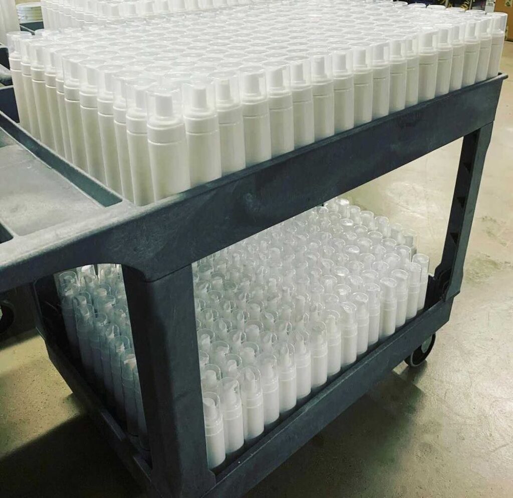
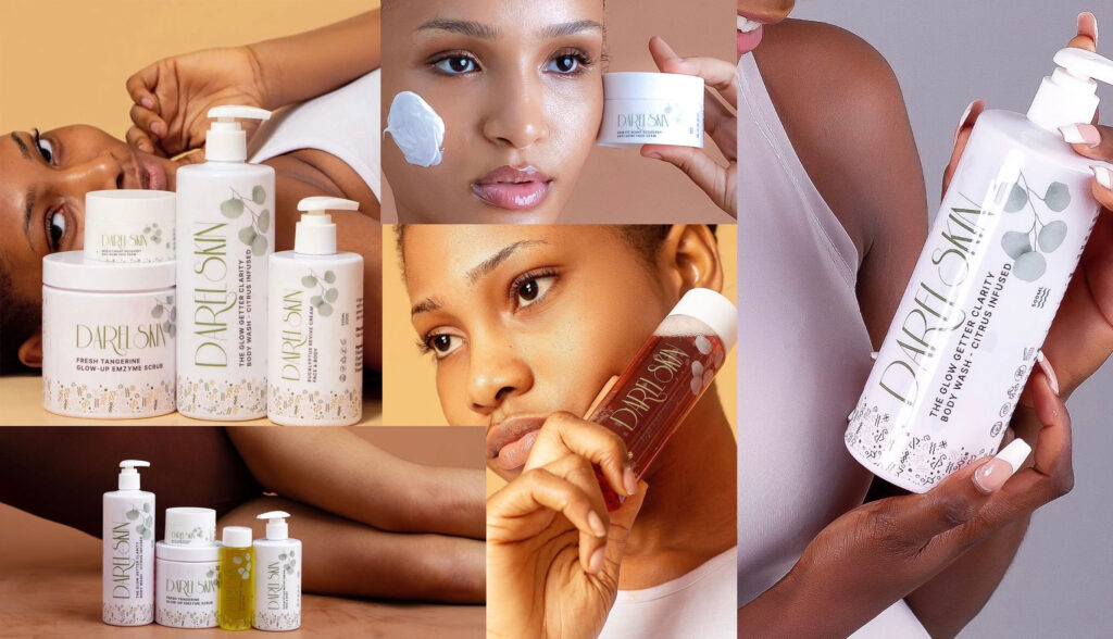
Let me share a detailed example with a past client – DarelSkin. She dreamed of launching a small cosmetics line from home. Custom molds were far out of her startup budget. These molds ensure efficient, scalable production while controlling the final shape, size, and visual aesthetics of containers. Without molds, we’d have to rely on generic packaging.

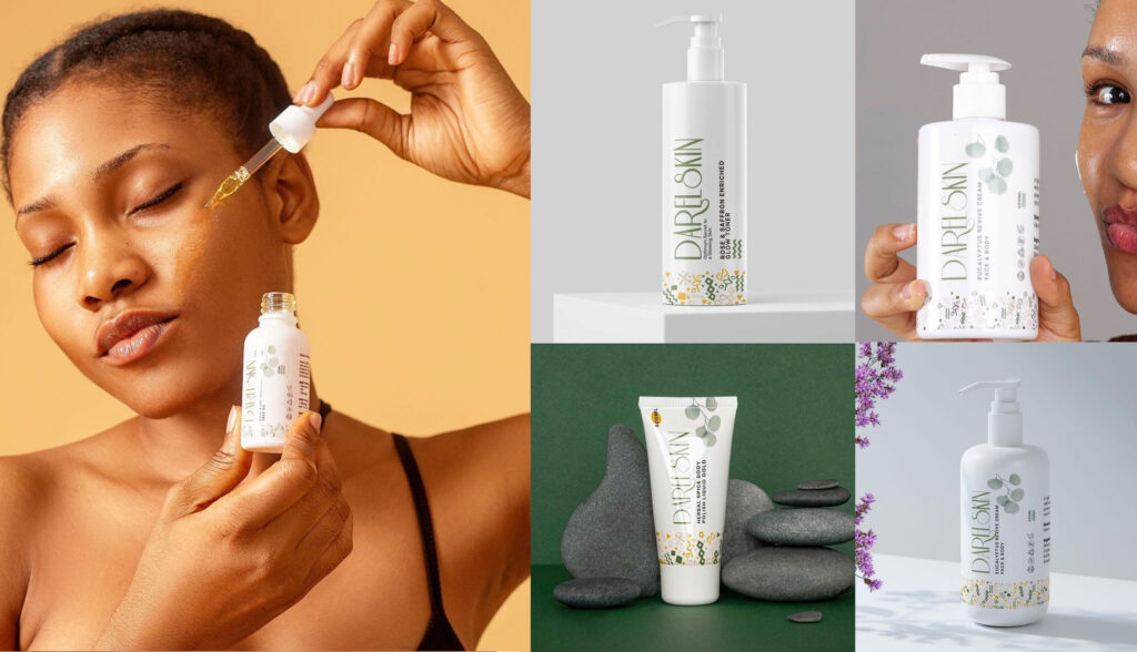
Rather than let this limitation sink the business, we got creative. We decided to use simple, affordable generic plastic bottles ordered online, but make them stand out with custom designed labels. Since the bottles themselves were plain white, we chose transparent labels with an elegant minimalist design. This allowed the product color and quality to shine through while still elevating the look.
For the typography, we stuck with clean, calligraphic fonts and ample white space instead of cluttered text. In the end, the Thoughtful Self-Care line exceeded all expectations. I also subtly incorporated botanical elements hinting at the natural formulas. The affordable packaging looked far more high-end than expected thanks to the branding details. This just goes to show, excellent design is possible even on a shoestring budget if you get creative and prioritize it.


In summary, packaging and labels create a vital first impression. While formula and quality matter tremendously, great branding and design is the key to initially attracting consumer interest. Prioritizing this aspect from the start can make all the difference in how a new product line is perceived.


Leave A Comment