Design

Introducing Miracle White: The Ultimate Whitening Soap

The global skin lightening products market was estimated at USD 9.96 billion in 2021 and is expected to grow at a compound annual growth rate of 5.5% from 2022 to 2030 to reach USD 16.14 billion by 2030. Given Nigeria’s high usage rate, it’s reasonable to infer that the country contributes a substantial portion to this global market.

According to the World Health Organization, 77% of women in Nigeria use skin lightening products and this is not about change anytime soon. Even with all the bad press about skin lightening the market is still expanding. Based on a personal survey at Trade Fair market – I discovered that marketers and distributors are more likely to accept skin lightening products as opposed moisturizers.

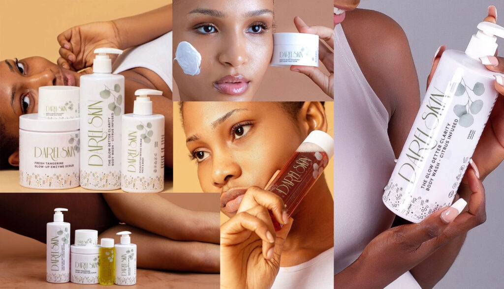
Apart from skin lightening creams and lotions, skin lightening soaps is another category of products that have seen tremendous increase in recent times. These category of product are most time sold 3x more expensive to their non lightening counterpart.

Although I don’t have an exact estimate or data on the sales of the product category but one thing is certain, the sales recorded is usually massive and mostly dominated by women. An average skin lightening soap can sell as much as N2500. This high usage rate is reflected in the fact that Nigeria leads in global skin whitening use.

Recently, I have been working on a Whitening Soap with the name Miracle White. Miracle White Daily Exclusive Whitening Soap is specially formulated to give you a visibly brighter, clearer and glowing skin. It works effectively to remove dark spots, freckles and also provides sun protection against harmful sunrays, giving you a brighter, softer & younger skin.

We needed a name is memorable, catchy and conveys the purpose of the brand. As the designer the upmost priority for me is to come up with an excellent design that is catchy and attractive enough to make our audience want to pick it up from the shelves.


lets talk about the image of choice

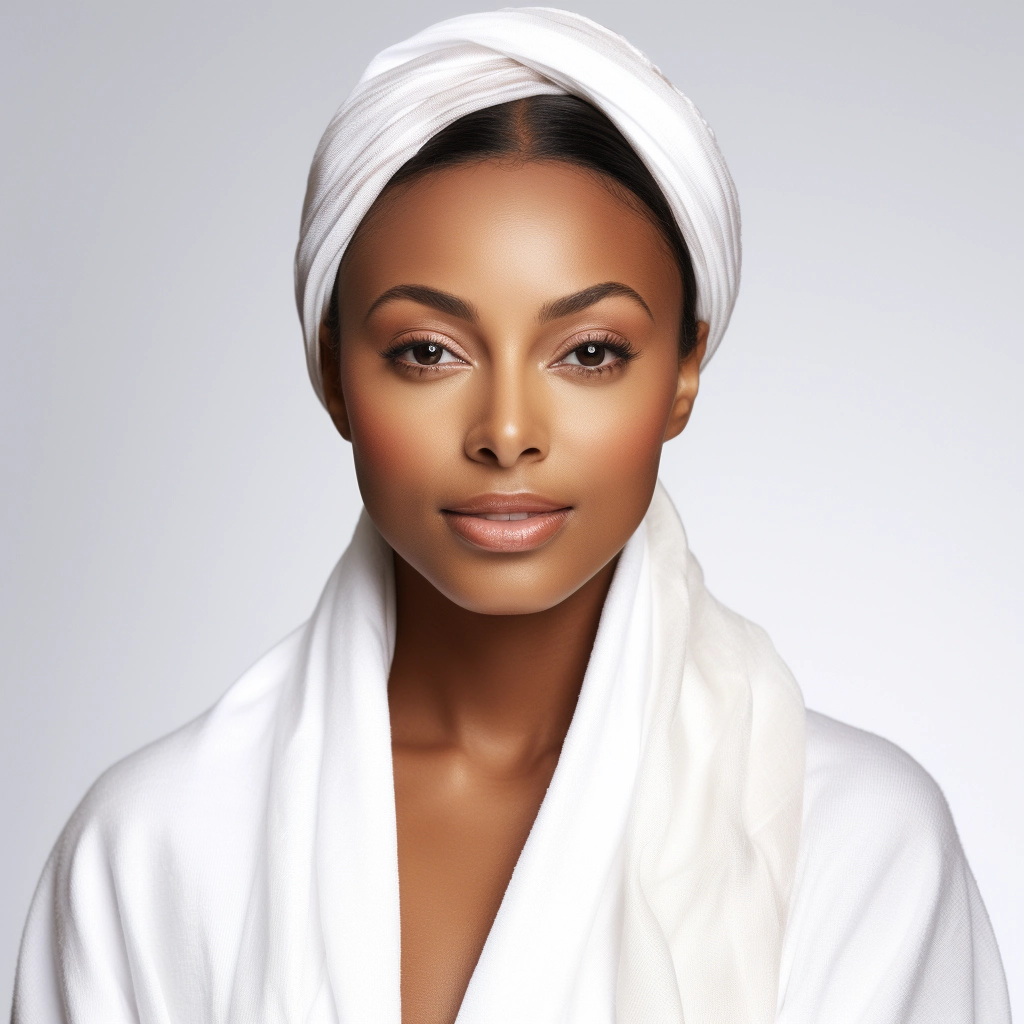
The image provided features a woman with a clear and even skin tone, which could be perceived as an aspirational result for consumers interested in skin lightening products. The use of white in the towel and sheet she is wearing can be associated with purity and cleanliness, themes often used in the marketing of skincare products. The simplicity of the image, with its neutral background and the subject’s direct gaze, allows the viewer to focus on the woman’s complexion, which aligns with the marketing message of a skin lightening soap that aims to promote a clear and even skin tone


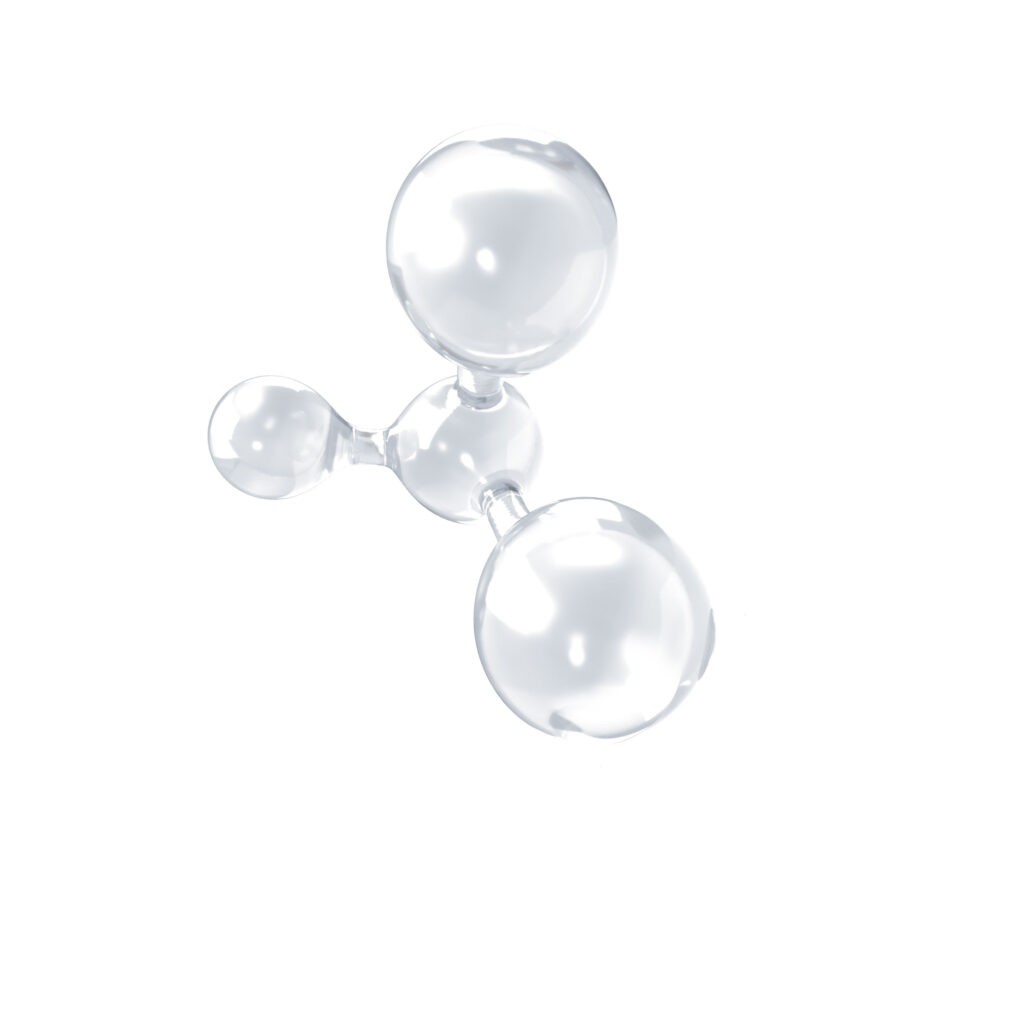
Brand Guideline – Molecular Imagery

In the context of a skin lightening soap like Miracle White, this molecular imagery is intended to convey a sense of scientific backing or to highlight the presence of specific active ingredients that work at the molecular level to achieve skin lightening effects. It was place there to communicate certain values or benefits of the product. In the case of Miracle White, the use of a molecule in the brand imagery signifies the product’s claims of effectiveness, suggesting that it works at a molecular level to deliver skin lightening benefits. This is an attempt to appeal to consumers looking for products with scientifically proven ingredients or mechanisms.


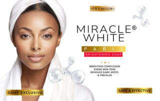
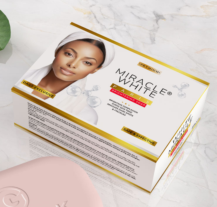
The cover of your Miracle White skin lightening soap incorporates several elements that contribute to its standout design:


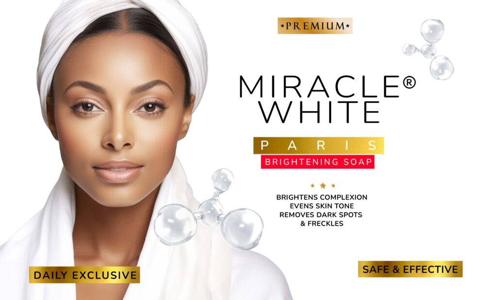
  • Color Scheme: The use of white and gold colors conveys a sense of luxury and premium quality. The white color is also symbolic of the product’s skin lightening benefits, while the gold implies a premium, high-end product.
  • Clarity of Message: The cover clearly states the benefits of the soap, such as “Brightens Complexion,” “Evens Skin Tone,” “Removes Dark Spots & Freckles,” which are all desirable attributes for potential customers[1].
  • Brand Positioning: The word “Paris”suggest a connection to French beauty standards, which are often associated with high-quality skincare products.
  • Product Features: The cover highlights that the soap is a “Daily Exclusive” and “Safe & Effective,” which reassures customers about the regular usability and safety of the product.
  • Quality Indicators: The use of stars and the label “Premium” serve as indicators of the product’s quality, suggesting that it is a top-tier option in its category.
  • Typography: The choice of fonts is modern and sophisticated, which helps to attract a contemporary audience and gives the product a professional appearance.
  • Trademark: The use of the registered trademark symbol (®) next to the product name indicates that the brand is established and protected, which can instill trust in consumers.

These elements work together to create a cohesive and attractive package that is likely to draw the attention of consumers looking for skin lightening and brightening solutions.


Introducing Miracle White: The Ultimate Whitening Soap2024-01-15T15:26:19+00:00

The Journey of Natures Gentle Touch: Crafting an Authentic Haircare Brand

My time at Natures Gentle Touch brought me great lessons on the branding and marketing process of natural haircare products. For more context Natures Gentle Touch is a natural hair care brand that provides solution to different hair and scalp problems such as dandruff, hair breakage, slow hair growth, hair loss, receding hairline, weak/damaged hair and dry hair.

The brand was conceived in 1996 by an Industrial Chemist called Chika Ikenga when he discovered that a large section of women in Africa found it very difficult going to the salon to relax their hair due to the scalp irritations and discomfort they experience whenever they apply relaxer products.

One of the things we did differently was to set up a Hair Clinic more like a salon but for strictly for the purpose of addressing hair problems and style natural hair. Overtime the hair clinic built up a strong reputation amongst women who wear their natural hair. As the brand communication executive one of my first initiative then was to kickstart the #RealPeopleRealHair trend. Basically what I do is to visit the clinic one a weeks and take the before and after photos of women with their treated style hair. With their permission these images was posted on social media and over time this grew momentum amongst women who will love to flaunt their natural hair.

Perception is key, so am ample amount of time was invested in creating the right look an feel for the brand. The goal as to adopt a minimalist approach with a lot of negative space, in other to help our brand standout. After a unanimous decision from the management we proceeded to creating a brand identity guideline that portrays what we wish to achieve


Hero the Botanicals

When it comes to organic haircare products, it is not enough to use organic ingredients, you have to show them. We did this by boldly displaying and describing the star botanical ingredients like Aloe Vera, Tea Tree, Coconut Oil, and Shea Butter. This builds desirability around the natural, ethically-sourced formulas. Instead of just using natural images, we went for vector drawings of these botanicals. This brings a unique and original feel to our packaging materials. Actually, I still feel it is an awkward practice to just add real images of organic products on your packaging materials – anybody can do it. But to differentiate your product, crafting unique vector images will give your products a one-of-a-kind look.


Clean Beauty Authority

It’s not just enough to have images of botanical ingredients on your product’s packaging. You still have a lot of work to make sure that your products adhere to their promises by rigorously avoiding suspect chemicals and using identifiable, nourishing plant actives. This earns trust. I can remember a particular product we launched that ended up causing an adverse effect on users. At first we weren’t sure which active was causing this problem, but when we finally discovered it, word had already spread and we had to discontinue that line. Even after manufacturing – before taking your product to market, it always pays to do a small study group where you test your product within the group before launching.


Empowering Mantras

When it comes to building a natural haircare brand, integrating uplifting messaging is key. Empowering slogans like “Awaken Your Natural Beauty” make customers feel confident in their hair journeys. This helps spark loyal brand followings that extend beyond just using the products. We integrated this philosophy into our “Real People Real Hair” campaign. Rather than featuring conventional polished models, we showcased vibrant stories from diverse women thriving beautifully in their own natural hair. The authenticity and self-acceptance ethos resonated widely, ultimately building an inspiring movement around embracing the best of one’s natural identity. It fulfilled our credo to products that uplift more than upsell.


Genuine Reviews

There is nothing more that informs purchase decisions than reviews from customers. When it comes to reviews, video reviews will always do better than text reviews. In those days, I would drive to the clinic just to shoot short video reviews of satisfied customers. Reviews depicting real customer experiences are used to reinforce your authenticity and hard-won happy clients already on board. These reviews can be used on your website and social media. To add an extra layer of awareness, it also pays to promote these reviews on social media to increase more awareness and reach.


Invest in premium yet playful packaging.

Packaging plays a crucial role. In a country like Nigeria, where everyone competes on price to beat your competition, you really need to pay extra attention to packaging and design. Whenever I see amazing products with poor packaging I cringe, like why go through the stress, commitment, investing a lot in product development, then falter in your packaging or design. All you needed to do is hire a good graphics designer. Again I can’t over emphasize the need for a brand identity manual. This manual should guide all your designs and its implementation. Your product’s brand should have a uniform look and feel, this makes it easily recognizable and memorable. Again, don’t always trust your judgement when it comes to approving designs – that is not your job, always leave it to the professionals – most times non artistic founders can have poor judgement when it comes to design.


Distribution

Distribution can be one of the biggest challenges facing manufacturers, especially for those looking to scale up. My content is focused mainly on supporting large-scale manufacturers. The first key question to ask is: Where do shops and supermarkets source their inventory? In most cases, they buy from major distributors in large markets.

Nearly every consumer product sold in Nigeria flows through a distribution network specific to that product category. For items like haircare and cosmetics, your best distribution channel is the Trade Fair Market – the largest cosmetics hub in West Africa. The goal should be to approach distributors at Trade Fair and negotiate terms. Some will purchase your products upfront, while others will sell on consignment and remit payments later. Either way, your pricing has to be attractive enough for these distributors to carry your products.

Beyond distributors, you also need to cultivate networks of marketers scattered across Nigeria who can get your products into neighborhood stores nationwide. The more retail outlets stocking your brand, the better. An expansive presence on both the wholesale distribution level and the retail marketing level is key for any major consumer products manufacturer looking to succeed in the Nigerian market.


Harness the power of influencer marketing.

When it comes to influencer marketing, getting the right ones with a wide reach matters a lot. Some of them just buy followers with very few engagements, while some have engagement with the wrong target market for you. You need to put all these in consideration before approaching any influencers. You don’t always need to go for the big and established ones. You can identify micro-influencers that fit your brand. Gifting them products and collaborating on sponsored content can help spread brand awareness. This was one of our approaches with Natures Gentle Touch and I can tell you for a fact that it is one of the brand awareness approaches that pivoted the most.


Tell a compelling brand story.

Telling a compelling brand story goes a long way in establishing the right emotional connection with your users or customers. Consumers today care more about the “why” behind brands. Share your origin story, values and purpose in an authentic way. When purpose permeates the customer experience, it cultivates lasting bonds that transcend transactions. People should feel so personally invested in the “why” empowering your brand that they eagerly transform into loyal brand advocates. Savvy storytelling establishes those ties that bind consumers to the brands they cherish.

While this list is not exhaustive, I have shared a few of the key strategic moves that helped launch Natures Gentle Touch and fuel its growth. Other brands can borrow from this playbook as well. Even just one or two of these tactics, when well executed, can make a huge difference. I hope these insights provide value to other aspiring entrepreneurs as they work to bring new and innovative haircare products to Nigerian consumers. The market is vast, the opportunities abound, but capturing mindshare and wallet share ultimately requires getting the basics right.

The Journey of Natures Gentle Touch: Crafting an Authentic Haircare Brand2023-12-03T11:31:18+00:00

The Power of Packaging: Why Good Label Design is Crucial for Small Brands

Quality packaging and label design should be a top priority for small-scale manufacturers right from the start. You can run your business from your bedroom and still look polished and upscale with the right product branding. Great design doesn’t have to break the bank, but it makes a world of difference in how consumers perceive your product.

Design is especially crucial when it comes to packaged goods. Your product has to visually stand out on crowded store shelves before shoppers will even consider picking it up and reading further. More often than not, people make snap judgements and buy the packaging and marketing message first, before ever trying the actual product inside. I’ve purchased many items solely based on aesthetics – I loved the branding, packaging, and messaging. Even if you have an outstanding formula or product, ugly packaging and labels can doom your success, no matter how much you invest in the actual product quality or marketing efforts.

This mistake is very common among many new skincare, cosmetic, and supplement brands. Some brands funnel tons of money into product development and marketing but completely neglect the visual design. The result is a mediocre or amateurish look that fails to resonate with consumers, regardless of how much is spent on ads or social media. First impressions matter tremendously in the consumer goods space.

If you don’t have an innate eye for good design, try not to make final branding or packaging decisions alone. Seek outside input from graphic designers or creative professionals. Hire a contractor to create visual assets even if you handle the rest of the business yourself. A small investment here goes a long way.

Minimalism and simplicity have become very trendy in modern product design across all categories. As the saying goes, less is more. Clean, sparse designs tend to look more upscale and appeal to consumers. Likewise, product names and branding guidelines matter just as much as the visual look.

Let me share a detailed example with a past client – DarelSkin. She dreamed of launching a small cosmetics line from home. Custom molds were far out of her startup budget. These molds ensure efficient, scalable production while controlling the final shape, size, and visual aesthetics of containers. Without molds, we’d have to rely on generic packaging.

Rather than let this limitation sink the business, we got creative. We decided to use simple, affordable generic plastic bottles ordered online, but make them stand out with custom designed labels. Since the bottles themselves were plain white, we chose transparent labels with an elegant minimalist design. This allowed the product color and quality to shine through while still elevating the look.

For the typography, we stuck with clean, calligraphic fonts and ample white space instead of cluttered text. In the end, the Thoughtful Self-Care line exceeded all expectations. I also subtly incorporated botanical elements hinting at the natural formulas. The affordable packaging looked far more high-end than expected thanks to the branding details. This just goes to show, excellent design is possible even on a shoestring budget if you get creative and prioritize it.

In summary, packaging and labels create a vital first impression. While formula and quality matter tremendously, great branding and design is the key to initially attracting consumer interest. Prioritizing this aspect from the start can make all the difference in how a new product line is perceived.

The Power of Packaging: Why Good Label Design is Crucial for Small Brands2023-10-03T13:00:34+00:00